Note
Go to the end to download the full example code.
Working with ArraySample
probly represents repeated stochastic predictions as a “sample”. For NumPy-like data,
the concrete implementation is probly.representation.sampling.sample.ArraySample.
This example shows:
building a sample from repeated model outputs, and
summarizing it with
meanandstd, andvisualizing predictive uncertainty as an error-bar plot.
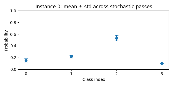
mean shape: (2, 4)
std shape: (2, 4)
mean[0]: [0.15       0.21666667 0.53333333 0.1       ]
std[0]: [4.08248290e-02 2.35702260e-02 4.71404521e-02 1.38777878e-17]
from __future__ import annotations

import matplotlib.pyplot as plt
import numpy as np

from probly.representation.sample import ArraySample

# Imagine these are 3 stochastic forward passes for 2 instances and 4 classes.
# Shape per pass: (instances, classes)
pass_1 = np.array([[0.1, 0.2, 0.6, 0.1], [0.7, 0.1, 0.1, 0.1]])
pass_2 = np.array([[0.2, 0.2, 0.5, 0.1], [0.6, 0.2, 0.1, 0.1]])
pass_3 = np.array([[0.15, 0.25, 0.5, 0.1], [0.65, 0.15, 0.1, 0.1]])
data_stack = np.array([pass_1, pass_2, pass_3])

# Create an ArraySample with sample_axis=0 (the first axis corresponds to the stochastic passes).
sample = ArraySample(data_stack, sample_axis=0)

# Compute mean and std across the sample axis (axis=0).
mean = np.mean(data_stack, axis=0)
std = np.std(data_stack, axis=0, ddof=0)
print("mean shape:", mean.shape)
print("std shape:", std.shape)
print("mean[0]:", mean[0])
print("std[0]:", std[0])

# Plot mean and std for the first instance (index 0).
classes = np.arange(mean.shape[1])
plt.figure(figsize=(6, 3))
plt.errorbar(classes, mean[0], yerr=std[0], fmt="o", capsize=4)
plt.xticks(classes)
plt.ylim(0, 1)
plt.xlabel("Class index")
plt.ylabel("Probability")
plt.title("Instance 0: mean ± std across stochastic passes")
plt.tight_layout()
Total running time of the script: (0 minutes 0.055 seconds)