Note
Go to the end to download the full example code.
Visualising OOD detection results
Out-of-distribution (OOD) detection asks whether a test sample comes from the
same distribution as the training data. The probly.plot module provides
three standard diagnostic plots:
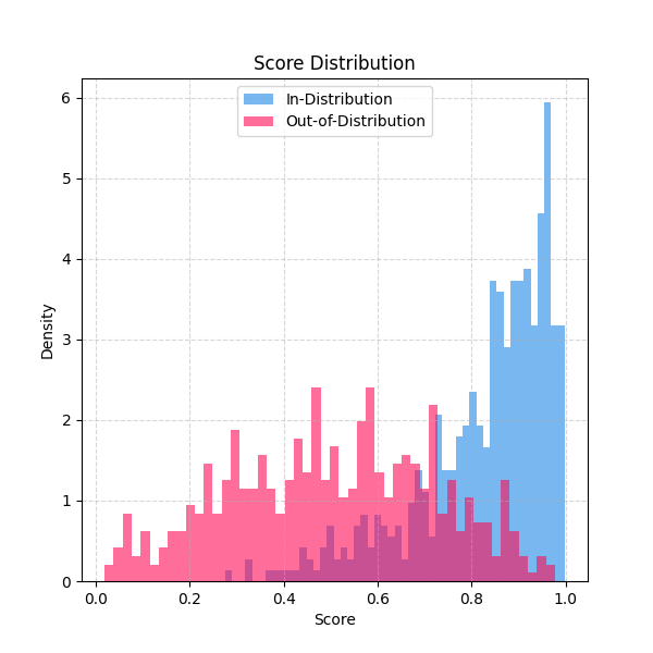
Histogram – overlapping score distributions for in-distribution (ID) and OOD samples.
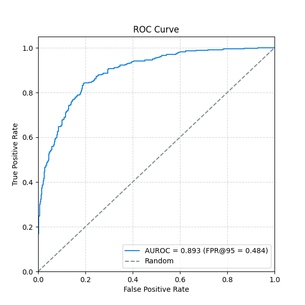
ROC curve – receiver operating characteristic with AUROC and optional FPR@95 annotation.
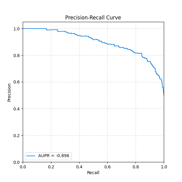
Precision-Recall curve – with AUPR summary.
All three accept an optional PlotConfig for consistent
styling across your project.
from __future__ import annotations

import matplotlib.pyplot as plt
import numpy as np
from probly.metrics import auc, precision_recall_curve, roc_curve

from probly.plot import PlotConfig, plot_histogram, plot_pr_curve, plot_roc_curve
Synthetic scores
Simulate confidence scores: ID samples cluster near 1, OOD samples are more spread out.
rng = np.random.default_rng(42)
id_scores = rng.beta(a=5, b=1, size=500)
ood_scores = rng.beta(a=2, b=2, size=500)
Score histogram
A quick visual check of how well the two distributions separate.
plot_histogram(id_scores, ood_scores)
plt.show()
ROC curve
Compute FPR/TPR from the scores and plot with AUROC annotation.
anomaly_id = 1.0 - id_scores
anomaly_ood = 1.0 - ood_scores
labels = np.concatenate([np.zeros(len(anomaly_id)), np.ones(len(anomaly_ood))])
preds = np.concatenate([anomaly_id, anomaly_ood])

fpr, tpr, _ = roc_curve(labels, preds)
auroc = auc(fpr, tpr)
idx_95 = np.where(tpr >= 0.95)[0]
fpr95 = float(fpr[idx_95[0]]) if len(idx_95) > 0 else None

plot_roc_curve(fpr, tpr, auroc=auroc, fpr95=fpr95)
plt.show()
Precision-Recall curve
Total running time of the script: (0 minutes 0.194 seconds)