Note
Go to the end to download the full example code.
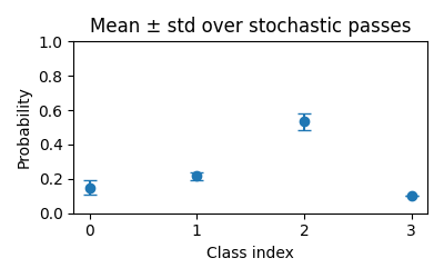
Hello, uncertainty (glimpse).
This tiny example shows how repeated stochastic predictions can be summarized into mean probabilities and visualized as error bars.
from __future__ import annotations

import matplotlib.pyplot as plt
import numpy as np

# Three stochastic passes for one instance and four classes
passes = np.array(
    [
        [0.1, 0.2, 0.6, 0.1],
        [0.2, 0.2, 0.5, 0.1],
        [0.15, 0.25, 0.5, 0.1],
    ]
)

mean = passes.mean(axis=0)
std = passes.std(axis=0, ddof=0)

classes = np.arange(mean.shape[0])
plt.figure(figsize=(4, 2.5))
plt.errorbar(classes, mean, yerr=std, fmt="o", capsize=4)
plt.xticks(classes)
plt.ylim(0, 1)
plt.xlabel("Class index")
plt.ylabel("Probability")
plt.title("Mean ± std over stochastic passes")
plt.tight_layout()
Total running time of the script: (0 minutes 0.056 seconds)