Credal Sets Visualization Plotting
This notebook demonstrates how to visualize Credal Sets to analyze model uncertainty.
A Credal Set is a set of probability distributions. Instead of predicting a single probability vector (e.g., [0.7, 0.3]), a model might predict a region of plausible probabilities (e.g., Class A is between 0.6 and 0.8). This is crucial for capturing epistemic uncertainty (lack of knowledge).
We will use the create_credal_plot function to visualize these sets in three scenarios:
Binary Classification (Interval Plots)
3-Class Classification (Ternary/Simplex Plots)
Multi-Class Classification (Spider/Radar Plots)
1. Import Libraries
We import the necessary modules. We rely on the credal_visualization module which handles the dispatching logic.
import numpy as np

try:
    from probly.visualization.credal.credal_visualization import create_credal_plot
except ImportError:
    from credal_visualization import create_credal_plot

np.random.seed(42)
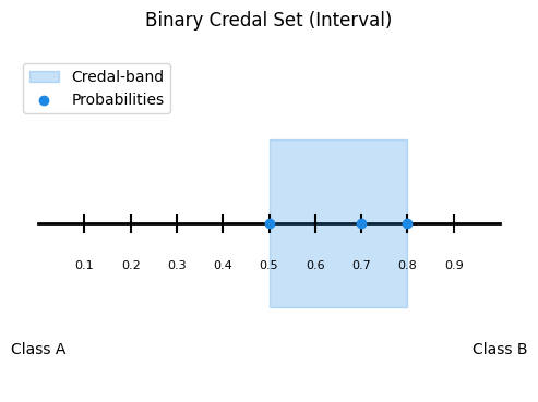
2. Binary Classification (2 Classes)
Visualization: Interval Plot
In binary classification, a Credal Set defines a range of probabilities for the positive class (e.g., $P(\text{Class 1}) \in [0.2, 0.5]$). The interval plot visualizes this range.
# Example Data
# We simulate a Credal Set defined by 3 vertex distributions for a binary problem.
# Each row is a valid probability vector [P(C0), P(C1)]
points_2d = np.array(
    [
        [0.2, 0.8],  # Vertex 1
        [0.5, 0.5],  # Vertex 2
        [0.3, 0.7],  # Vertex 3
    ]
)

# Define labels
labels_2d = ["Class A", "Class B"]

# Create Plot
# The function automatically detects 2 classes and draws an Interval Plot.
create_credal_plot(
    input_data=points_2d,
    labels=labels_2d,
    title="Binary Credal Set (Interval)",
    choice="Credal",  # Show the Credal Set range
)
<Axes: title={'center': 'Binary Credal Set (Interval)'}>
Interpretation
Blue Bar: Represents the range of uncertainty. The true probability is believed to lie somewhere within this bar.
Red Dot (if enabled): Represents the MLE (Mean/Average) prediction.
3. Ternary Classification (3 Classes)
Visualization: Ternary (Simplex) Plot
For 3 classes, the probabilities sum to 1, forming a 2D triangle (Simplex). A Credal Set is a polygon (convex hull) inside this triangle.
# Example Data
# Simulate a Credal Set for 3 classes (e.g., Detractor, Passive, Promoter)
# These points define the corners of the uncertainty region.
points_3d = np.array(
    [
        [0.7, 0.2, 0.1],  # Mostly Class 1
        [0.4, 0.3, 0.3],  # Uncertain
        [0.6, 0.1, 0.3],  # Mix of 1 and 3
    ]
)

labels_3d = ["Detractor", "Passive", "Promoter"]

# Create Plot
# Automatically detects 3 classes and draws a Ternary Plot.
create_credal_plot(
    input_data=points_3d,
    labels=labels_3d,
    title="Ternary Credal Set (Simplex)",
    choice="Credal",  # Highlights the convex hull
)
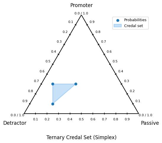
<Axes: title={'center': 'Ternary Credal Set (Simplex)'}>
Interpretation
Blue Area: The convex hull representing the Credal Set. A larger area implies higher epistemic uncertainty.
Corners: Represent certainty (100% probability for one class).
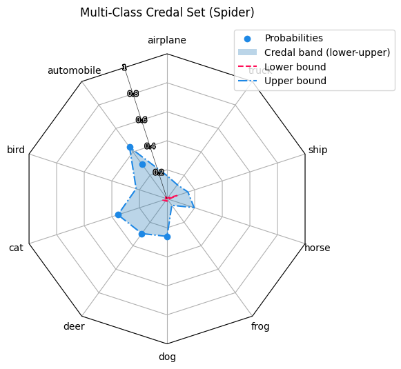
4. Multi-Class Classification (4+ Classes)
Visualization: Spider (Radar) Plot
For high-dimensional data (e.g., CIFAR-10 with 10 classes), we cannot use a simplex. Instead, we use a Spider Plot to show the Min/Max probability bounds for each class.
# Example Data
# Simulate a scenario with 10 classes (e.g., CIFAR-10)
# We generate 5 "sample" probability vectors that form the Credal Set.
n_classes = 10
n_samples = 5
points_multi = np.random.dirichlet(alpha=np.ones(n_classes), size=n_samples)

# Custom labels
labels_multi = ["airplane", "automobile", "bird", "cat", "deer", "dog", "frog", "horse", "ship", "truck"]

# Create Plot
# Automatically detects >3 classes and draws a Spider Plot.
create_credal_plot(
    input_data=points_multi,
    labels=labels_multi,
    title="Multi-Class Credal Set (Spider)",
    choice="Credal",  # Shows the min-max bands
)
<RadarAxes: title={'center': 'Multi-Class Credal Set (Spider)'}>
Interpretation
Red Line (Lower Bound): The minimum probability assigned to each class across the set.
Blue Line (Upper Bound): The maximum probability assigned to each class.
Shaded Band: The uncertainty gap. A wide band for a specific class means the model is unsure about that specific class.
5. Customizing your plots
The credal visulization is created in a way so you can choose between different styles.
By changing the flags with create_credal_plot(), you can influence the result.
choice:
if left empty, automatically shows both MLE and Credal Hull.
choice = "MLE": Only shows MLE and Probabilities.choice = "Credal": Only shows Credal Hull and Probabilities.choice = "Probabilities": Shows neither MLE nor Credal Hull. Only Probabilities.
minmax:
Only works for
plot_3d.pyand if credal band is visible.minmax = False: Does not show minmax.minmax = True: Shows minmax.
6. Conclusion
The create_credal_plot function provides a unified interface to visualize uncertainty across different dimensions:
Intervals for precise binary bounds.
Simplexes for geometric interpretation of 3-class problems.
Spider Plots for scaling to many classes.
By inspecting these plots, we can distinguish between aleatoric uncertainty (data noise, often irreducible) and epistemic uncertainty (model ignorance, represented by the size of the set/area).